When it comes to designing a headline, the typeface you choose can make all the difference. A good typeface should not only be legible but also capture the essence of your message and draw the reader in.
In this blog post, we're going to dive right into the world of typefaces and discover some popular and effective fonts for headlines. Will you join us?
What is typography?
Understanding Typography, it is essential to start with its etymology. “Typography” is a a term of Greek origin consisting of two elements: “typo,” which translates as “figure” or “impression,” and “graphia,” which refers to the art of writing. Thus, typography refers to the art of giving form to written text.
Thus, We define typography as the technique of designing letters graphically. It is the art and practice of creating and arranging type—that is, letters and characters—to make text legible, visually appealing, and coherent.
Originally, it referred to the the process of selecting and organizing font styles when printing text. Nowadays, extends to the design of digital characters and their proper use across various media, such as websites, books, and signage.
Typography It includes the selection of fonts, font size, line spacing, spacing between letters and words, and character design. Each typeface, or font, has its own personality and can influence how the message is perceived.
There are different branches within typography, such as creative typography, which explores graphic forms beyond linguistic communication, and editorial typography, which focuses on the normative properties of typeface families. In addition, This practice plays a crucial role in the branding and visual identity of a brand or product.
Why is it so important?
Typography plays a vital role in our daily lives. However, getting down to business, in graphic design and visual communication is crucial, since it not only facilitates the effective communication of messages, but also ensures that the content is readable and usable in a wide variety of media.
Thus, contributes significantly to the aesthetics of a design and it is a powerful tool for building and reinforcing a brand's identity. Furthermore, typography is essential for create a clear visual hierarchy, that guides the reader through a text and improves the user experience in interface design, directly impacting usability and accessibility.
No, typography and font are not the same thing
Typography and Fonts They are two related but distinct concepts. On the one hand, as we have already seen, Typography refers to the art and technique of arranging type so that written language is effective and aesthetically pleasing. when it is printed or displayed. This includes font selection, page layout, character and line spacing, and text organization.
On the other hand, A font is a set of characters of the same style and size that are part of a typeface family. In modern terms, a font is a digital file that contains all the information needed to display these characters on screen or in print, such as size, weight, and style.
Types of Fonts for Headings
Now that we've learned what typography means and have put it into context, Let's now take a closer look at the typography used for titles. This is crucial because It captures the reader's attention right from the start. This ensures that the content is quickly understood, creates a visual distinction between the title and the body text, contributes to a smooth reading experience, and enhances brand recognition.
As a result, let's find out the most eye-catching fonts for headlines that best capture the public's interest:
Serif: Classic Elegance
Sources Serif, known for their small decorative lines or extensions at the ends of their letters. They are ideal for titles that seek convey an air of formality and elegance and are often used for official projects, professional projects, undergraduate or master's theses, etc. Classic examples include:
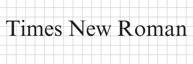
- Times New Roman: Traditional and reliable, it is perfect for academic and professional settings.
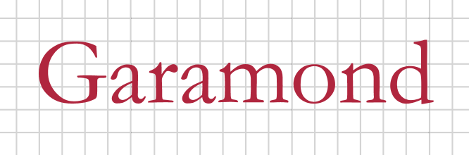
- Garamond: With its vintage style, it adds a touch of sophistication.
Sans Serif: Modernity and Clarity
Sources Sans Serif they lack additional lines at the ends of the letters, They have clean lines, which give them a fresher, more minimalist, and modern look. They're excellent For degrees in contemporary design:
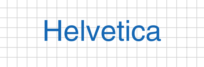
- Helvetica: Known for its readability and simplicity, It's a safe choice for almost any situation.
- Arial: Similar to Helvetica, but more widely available across different systems. As a general rule, this It is the default setting in many word processors.

Display: Personality and Focus
Sources Display are Designed to catch the eye, they are bold, attractive, and perfect for instantly grabbing the user's attention. They are ideal for titles that require a strong visual impact, such as logos, magazine covers, or posters:
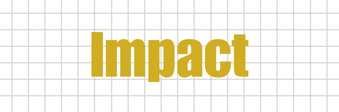
- Impact: As the name suggests, This font is ideal for headlines that need to stand out.
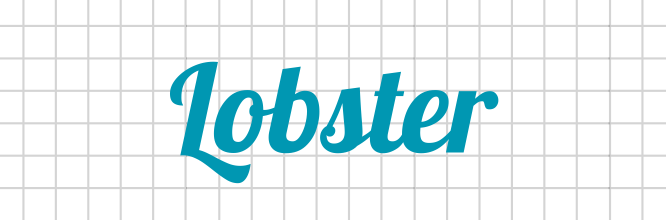
- Lobster: It offers a a fun and friendly touch, perfect for less formal settings.
Script: Fluid Elegance
Sources Script They mimic handwritten calligraphy and are perfect for adding a touch of elegance and delicacy to titles. They're great for projects that seek a personal and artistic touch, such as wedding invitations or announcements for any type of event:
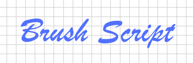
- Brush Script: This font is fluid and relaxed, ideal for informal or creative titles.
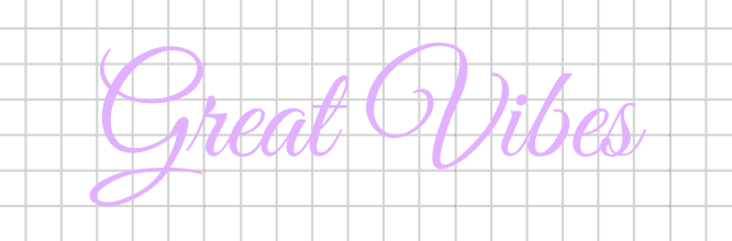
- Great Vibes: It provides a a sense of elegance and refinement.
Tips for Choosing the Right Typeface Family
Choosing the right font for your project can be a challenging task, but with the following tips, you'll be able to make an informed choice that enhances the quality of your design:
- Consider the context: Keep in mind that the font should match the tone of the content.
- Readability: Make sure the font is easy to read, especially at large sizes.
- Contrast: Use typographic contrasts to highlight important parts of the title.
- Trial and error: Don't be afraid to experiment with different fonts until you find the perfect one.